wa2.gif (4241 bytes)


abut9.gif (3095 bytes)


abut12.gif (3207 bytes)
abut10.gif (3636 bytes)


abut11.gif (4039 bytes)


Back labels

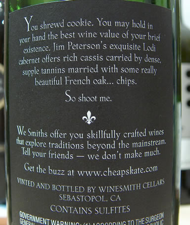
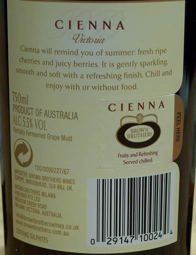
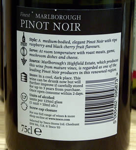
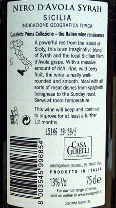
Back labels offer one of the few opportunities for producers to communicate with their public. Some take this chance well, others make a hash of it—and still others decide to go without a back label at all (they are extremely rare in Bordeaux, Burgundy and other classic French regions). Here I examine the back labels from a fairly random assortment of wines, and give some opinions. 

Overall, I'm surprised producers don't take more care over their back labels. I guess if they are exporting to several countries they need several different ones. At the very least, I'd suggest getting them checked over by a native speaker of the language in question, and use of a spellchecker is also advised.

The humorous approach on this Cheapskate Cabernet from California: using humour can be risky, but here it works well. Nice design and attractive font. It's a winner.
A simple descriptive label from Brown Brothers: nice design and user-friendly: the tear off strip is a good idea, especially for restaurants - if punters enjoy it, they can search for it elsewhere.

The supermarket approach: Tesco's label aims to take all the mystery out of buying wine. Explains everything, but little flair or imagination.

Clearly this Chianti producer didn't have much to say about their wine. All that white space: the equivalent of dead air on radio? Could do better.

Don't know where Sicily is? Casa Girelli point it out on a map of Italy on the back of their Canaletto red. Copy is well written, even if the design is a little bit boring. 

Onto page 2, some more back labels

Back to top